 |
By piecing together a series of normal photographs, panoramic and wide angle views can be created in the GIMP. The approach of piecing together a group of images to create a panorama instead of using special purpose camera lenses gives rise to a number of photo inconsistencies among the individual pieces of the image. Nevertheless, the GIMP is perfectly capable of correcting these problems and creating a well integrated whole. This chapter describes the problems involved in creating panoramas from collections of individual images and how to overcome them in the GIMP.
To create a panorama from a collection of photos, the steps are well defined. First, the photos have to be grouped together into a single image, each placed into a separate layer. The procedure for this has been explained many times already in this book. In particular, Section 2.4 describes the copying and pasting of images into layers, and Section 2.6.1 explains how to position layers within an image.
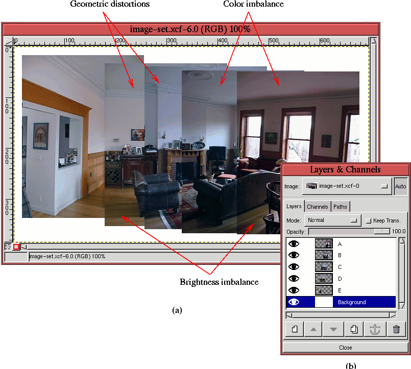
Figure 7.35(a)
Figure 7.35(a) shows the result after positioning the layers as well as possible, and Figure 7.35(b) shows the organization of the layers in the Layers dialog. The layers are named with the letters of the alphabet, A through E, where A corresponds to the rightmost layer and E to the leftmost.
Figure 7.35 illustrates the primary problems that must be overcome to achieve a consistent looking panorama. As shown, these problems are geometric distortion, color matching, and brightness matching. Each of these is addressed in the following sections.
The first step after the initial positioning of the individual layers is to remove, as much as possible, the geometric distortions. Figure 7.35(a) has distortions that can be seen in several places. The two most flagrant problems are the molding around the ceiling of the room and the alignment of the grain in the hardwood floor, especially on the left side of the image. However, there are also many other small details in the image that are slightly off kilter. Also, there are several places where elements of the images do not line up properly.
The first step is to correct for the misalignment problems. Using the Scale option of the Transform tool, some of the layers are squeezed in an effort to make them more consistent with the others. A very important guideline, however, is that there are limits to what can be done without introducing other serious mismatches. The goal is to adjust, but with a light hand.
Referring again to Figure 7.35(a), perhaps the biggest inconsistency is that the vertical scale of the image in layer C seems to be larger than the others. This explains the lack of registration of the ceiling molding and the fireplace mantle for this layer. The remaining details might be acceptable defects. This will be reevaluated after the most important corrections are made.
Before you begin, it is worthwhile to point out that, of all the Transform tool options, Scaling introduces the fewest artifacts. This is especially true when care is taken to maintain the aspect ratio between the horizontal and vertical dimensions. The Scaling option of the Transform tool can be constrained to preserve aspect ratio by pressing the Control and Alt keys together while scaling.
Figure 7.36(a)
How was the value 0.95 determined? The answer depends on whether you are challenged by ratios. If not, the swiftest way is to use the Measure tool to determine that the height of the molding at the left edge of layer C is 271 pixels from layer C's bottom edge, and that the height of the molding in layer D at layer C's left edge is 258 pixels. This makes the ratio 258/271 = 0.95. If you don't like ratios, a simple trial-and-error approach does not take much more time. Just choose a scaling factor and use C-z to perform an undo if the scale isn't correct. The result of the scaling operation aligns the molding on the ceiling between layers C and D.
As already noted, the upper right corner of layer C was used to perform the scale. Thus, layer C has shrunk horizontally by 5%, shifting its right edge to the left. This means that to properly register with layer C, layers A and B must now be repositioned to the left.
You can see that there is significant brightness variation from layer to layer in Figure 7.35. This is normal for photos taken with most consumer digital and regular film cameras. These cameras typically auto-expose scenes according to average lighting conditions and do not offer user controls for exposure. For the image in layer A of Figure 7.35 the light, coming from the windows is very bright which, due to the average light metering of the camera, causes the features of the room's interior to be underexposed. Thus, the room features in this layer are quite a bit darker than in the other layers. Otherwise, the brightness of the other layers are more or less consistent with each other.
In addition to the brightness mismatch between layers you can also see from Figure 7.35 that there is a color balance mismatch from layer to layer. The combination of color and brightness variations means that the layer boundaries are plainly visible instead of presenting a smooth and imperceptible transition across the panorama.
The strategy for correcting the differences in brightness and color is to use the Curves tool. The idea is to match color at boundaries between layers using a method similar to that described in Section 6.2.2. The method measures pixel values on both sides of a layer boundary using the Color Picker tool. The Curves tool is then used to match the values. This procedure corrects for both color and brightness mismatch simultaneously.
Matching the color and brightness of two layers has a chain reaction effect in a panorama project. Matching layer B to its neighbor A, means that subsequently layer C must be matched to B, and so on. Thus, some care must be taken to avoid blowing out the available tonal range. Typically, the wisest decision is to choose the layer of average brightness and to match the other layers working away from this one. However, for this panorama project, it is layer E that is chosen as the reference because its lighting for the room seems the most natural. The work flow, then, is from the leftmost layer to the rightmost, from layer E to layer A.
Starting with the boundary between layers E and D, a pixel value was measured on the white wall just above the wood wainscoting. The measured values are 177R 183G 194B to the left of the boundary and 153R 156G 171B to the right. Using this information, the Curves tool is used on layer D to match the pixel values measured in D to those of layer E. Representative pixels are then measured across the boundary between layer D and layer C. Here, the measured pixel values are located at the midway point between the hanging picture and the ceiling molding. The values are found to be 179R 175G 185B to the left of the boundary and 112R 119G 139B to the right. The Curves tool is employed again, this time on layer C, matching C's pixel values to those of D's.
Continuing with the boundary between layers C and B, the measured pixel values at a point midway between the mantle and the molding are 201R 197G 211B to the left and 101R 99G 112B to the right. The final boundary is between layers B and A. Here the pixels are measured at the midpoint between the plant and the molding. The values found are 199R 198G 208B and 86R 75G 81B. The Curves tool is applied for each of these boundaries, as it was for the first two.
The results of the color and brightness matching operations are shown
in Figure 7.37.
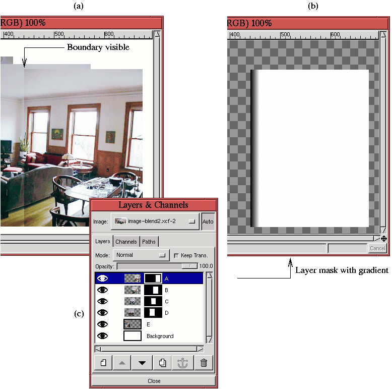
The remaining color mismatches at layer edges can be corrected using layer masks. The idea is to blend the edges by using a gradient in a layer mask. The technique of layer blending using a gradient in a layer mask is discussed in Section 4.3.3.
Figure 7.38(a)
 |
Figure 7.39(a)
Although the gradient blending trick works well in most cases, there are times when it is not appropriate for the entire boundary between two layers. In this case, parts of the boundary can be targeted for a blending gradient by using the Rectangle Select tool. This is necessary, for example, for the blend of layers D and E. Here, separate selections are made at layer D's left edge for the regions corresponding to the hardwood floor, the wainscoting, and upper wall areas. Separate gradient blends are produced for each one.
The layer mask produced by these separate gradients is shown in
Figure 7.40(a).
At this point in the creation of the panorama, the image can be
cropped and the various layers merged . Using the Crop tool to retain only the regions
corresponding to a complete rectangular image produces
Figure 7.41.
There is a remaining defect that still seems important in the image:
the molding along the ceiling in what was layer E before the merge.
This piece of molding is not properly aligned with that of what was
layer D. The Clone tool described in
Section 6.3 can be used to repair this defect. You
can repair the molding by cloning the lower edge of the old layer E's
visible molding to the top edge. This makes it vertically align with
the molding in the segment from the old layer D. After the top edge
has been reconstructed in this way, you can eliminate the lower edge
by cloning the unadorned part of the wall just below it and using this
to cover it up. The resulting final panorama is shown in
Figure 7.42,